Microsoft Teams Onboard
Microsoft Teams Onboard
The Microsoft Teams Help canvas provides learning content to guide user adoption, but few accessed it—and many dropped off quickly. We used design thinking to reimagine a more personalized help and learning experience.
The Microsoft Teams Help canvas provides learning content to guide user adoption, but few accessed it—and many dropped off quickly. We used design thinking to reimagine a more personalized help and learning experience.
OVERVIEW
The Challenge
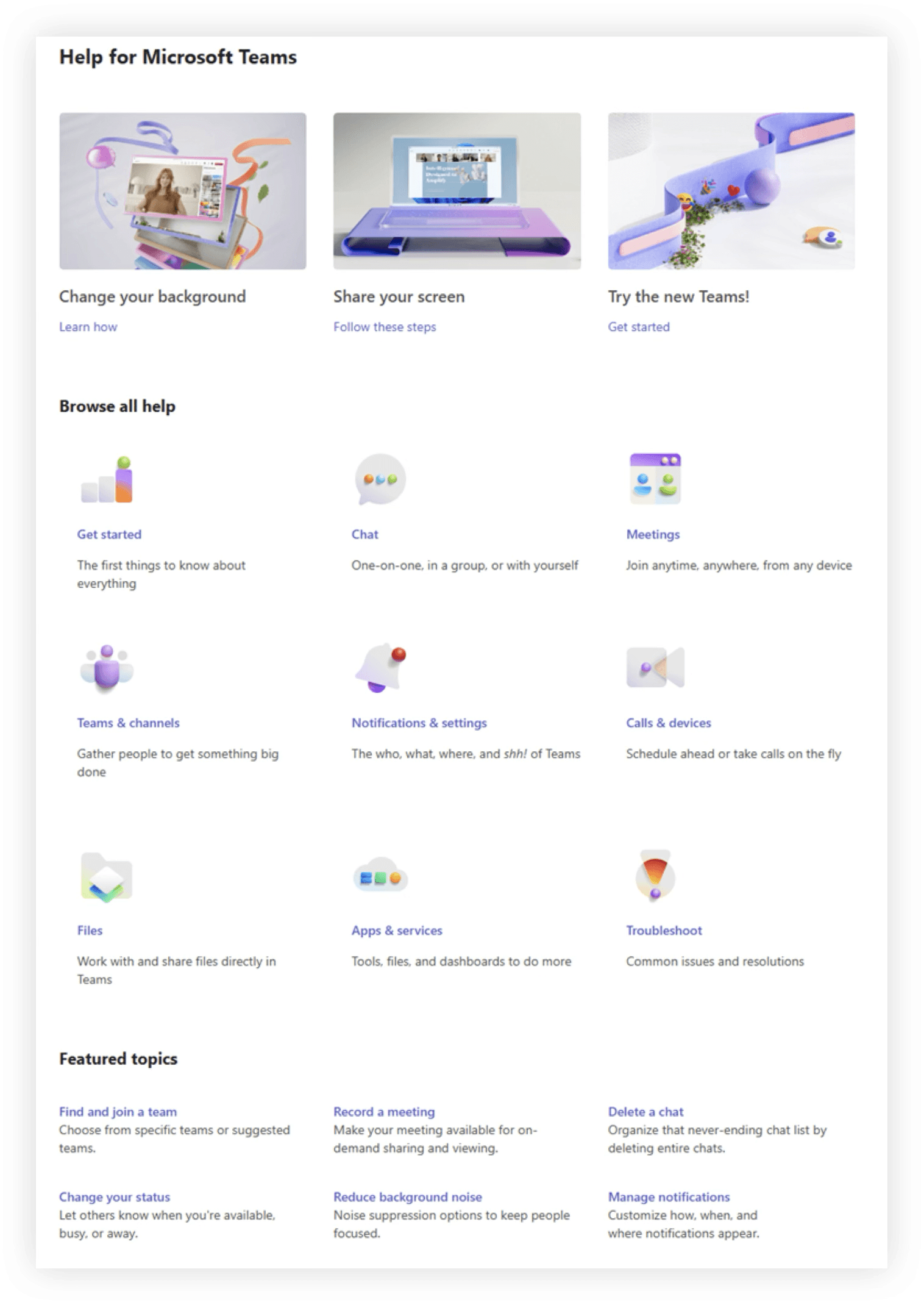
The Microsoft Teams Help canvas is made up of learning content that aims to instruct, support and update users along their adoption journey to Teams.
However, data showed people really struggled to find relevant and targeted self-service content - only 10% of users click on help and when they did, the drop-off rate was high (actual data omitted). We used design thinking to explore the future of personalized help and learning experience.
My Role
Design leadership for short term solutions and Design thinking facilitation future concepts. The extended project team included product management, dev, content platform leaders, design system, content design, research and data science.
Team developed personas, user flows, design principles, usability report, UX concepts and future vision video.
OVERVIEW
The Challenge
The Microsoft Teams Help canvas is made up of learning content that aims to instruct, support and update users along their adoption journey to Teams.
However, data showed people really struggled to find relevant and targeted self-service content - only 10% of users click on help and when they did, the drop-off rate was high (actual data omitted). We used design thinking to explore the future of personalized help and learning experience.
My Role
Design lead for short term solution. Design thinking facilitation of future concepts.
Team developed persona, user flows, design principles, usability report, future vision video. Extensive cross-org collaboration with Fluent and Teams framework team.
OVERVIEW
The Challenge
The Microsoft Teams Help canvas is made up of learning content that aims to instruct, support and update users along their adoption journey to Teams.
However, data showed people really struggled to find relevant and targeted self-service content - only 10% of users click on help and when they did, the drop-off rate was high (actual data omitted). We used design thinking to explore the future of personalized help and learning experience.
My Role
Design leadership for short term solutions and Design thinking facilitation future concepts. The extended project team included product management, dev, content platform leaders, design system, content design, research and data science.
Team developed personas, user flows, design principles, usability report, UX concepts and future vision video.
UNPACKING THE PROBLEM
Overcoming multi-window management
Overcoming multi-window management
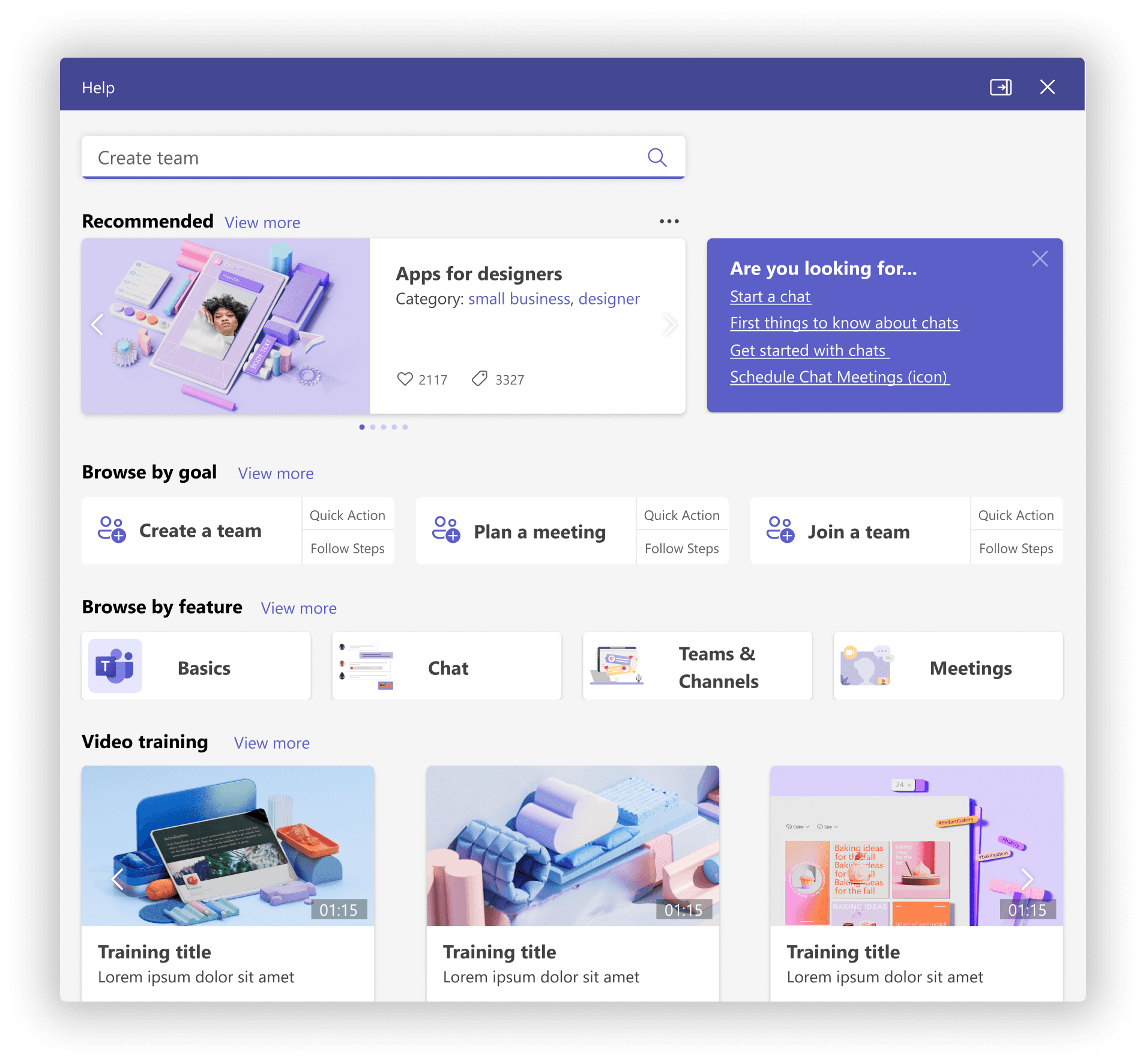
We reviewed user research comparing user perception of the full screen (left) vs. pop-out help (right). Findings revealed people struggled switching from full screen help back to Teams. This led to dissatisfaction, errors while trying to follow steps and longer times to complete tasks.
We reviewed user research comparing user perception of the full screen (left) vs. pop-out help (right). Findings revealed people struggled switching from full screen help back to Teams. This led to dissatisfaction, errors while trying to follow steps and longer times to complete tasks.
I feel like I couldn't really refer back … once I left the help experience and went to teams. - Participant
I feel like I couldn't really refer back … once I left the help experience and went to teams. - Participant
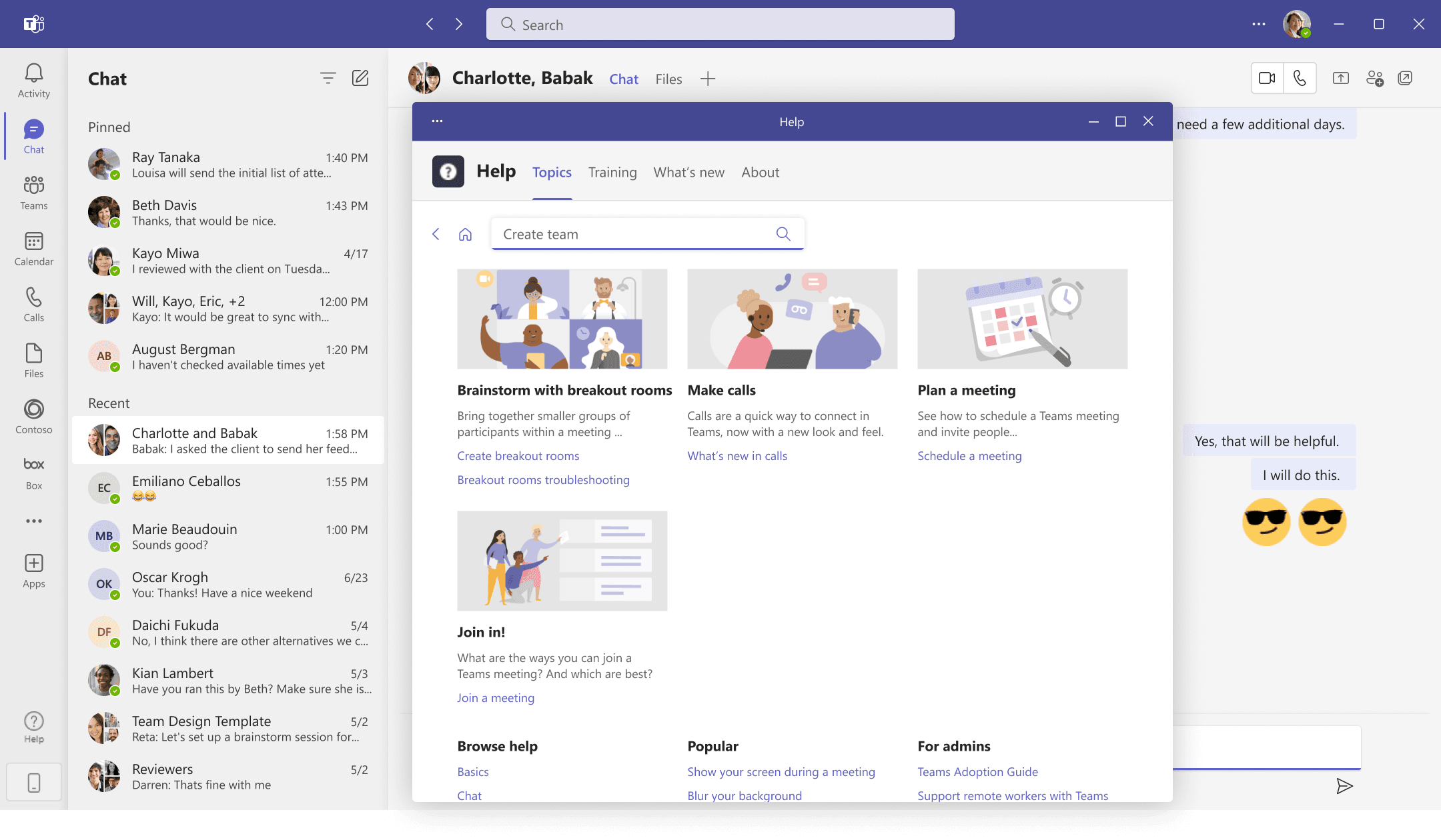
Participants thought a pop-out canvas would better aid multi-tasking (viewing help guidance and executing them at the same time). Based on these findings, pop-out help had been rolled out.
Analytic data showed an integrated "sidebar" in apps like Word, Powerpoint, and Excel had higher engagement rates.
Could the sidebar approach work for the Teams app ?
Full Screen Help
Full Screen Help
Full Screen Help
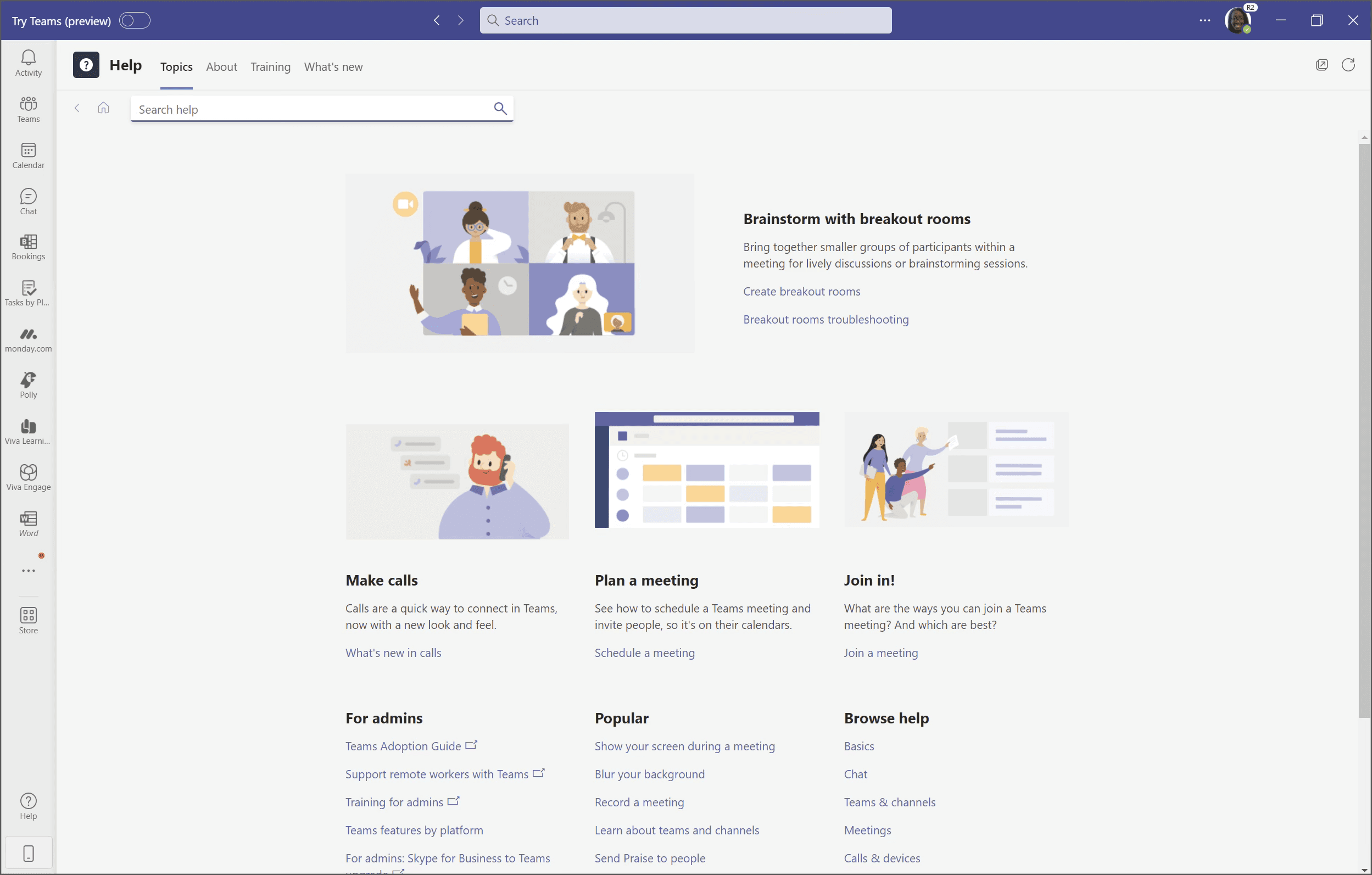
Pop-out Help
Pop-out Help
Pop-out Help
Delivering quick wins despite limitations
Delivering quick wins despite limitations
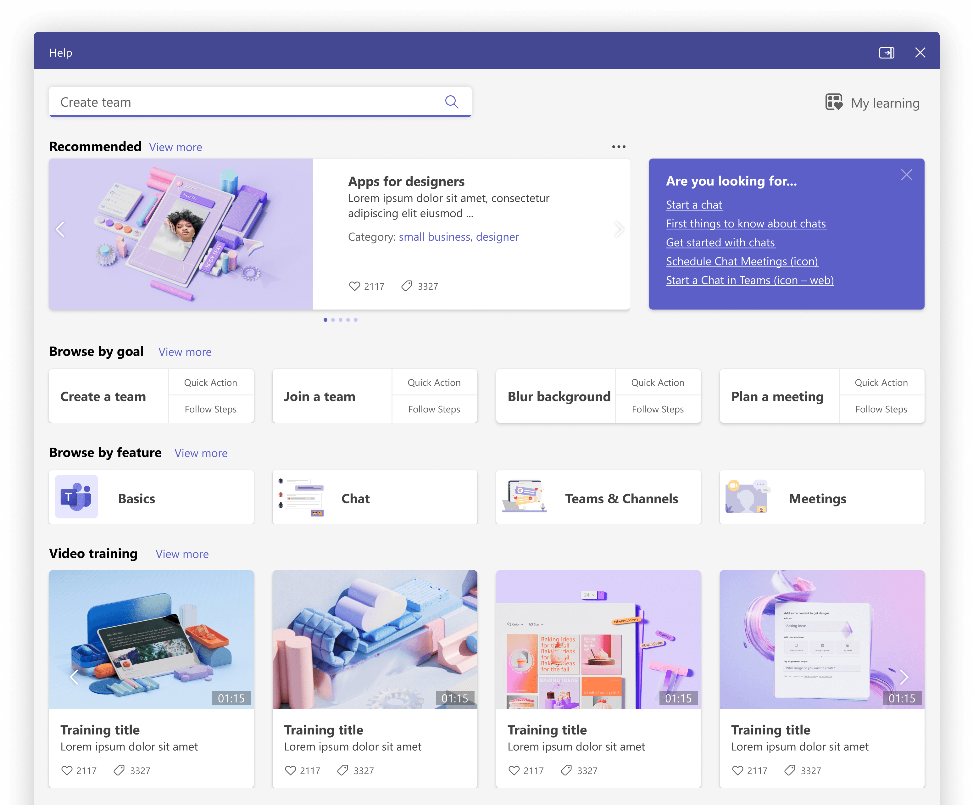
In parallel, we focused on short term wins to further increase engagement. The underlying content management system was a constraint - requiring dev resources and budget to make significant changes. Despite this, we demonstrated value with quick wins:
Updated the visual design with Microsoft Fluent.
Prioritized information layout with most important tasks based on web analytics.
New and expanded Browse by feature to encourage discovery.
This resulted in an engagement increase of over 50% and proved brand look and feel and information architecture significantly strengthen user experience.
We discovered that the underlying CMS for the help app was fairly inflexible and required dev resources and budget to update. We demonstrated value quickly by focusing on short-term wins:
Updated the visual design with Microsoft Fluent.
Prioritized information layout with most important tasks based on web analytics.
New and expanded Browse by feature to encourage discovery.
This resulted in an engagement increase of over 50% and proved brand look and feel and information architecture significantly strengthen user experience.
In parallel, we focused on short term wins to further increase engagement. The underlying content management system was a constraint - requiring dev resources and budget to make significant changes. Despite this, we demonstrated value with quick wins:
Updated the visual design with Microsoft Fluent.
Prioritized information layout with most important tasks based on web analytics.
New and expanded Browse by feature to encourage discovery.
This resulted in an engagement increase of over 50% and proved brand look and feel and information architecture significantly strengthen user experience.
RESEARCH INSIGHTS
Learning how people felt about help and learning
Learning how people felt about help and learning
As we focused on a new vision for help and learning, we started reviewing prior years research.
As we focused on a new vision for help and learning, we started reviewing prior years research.
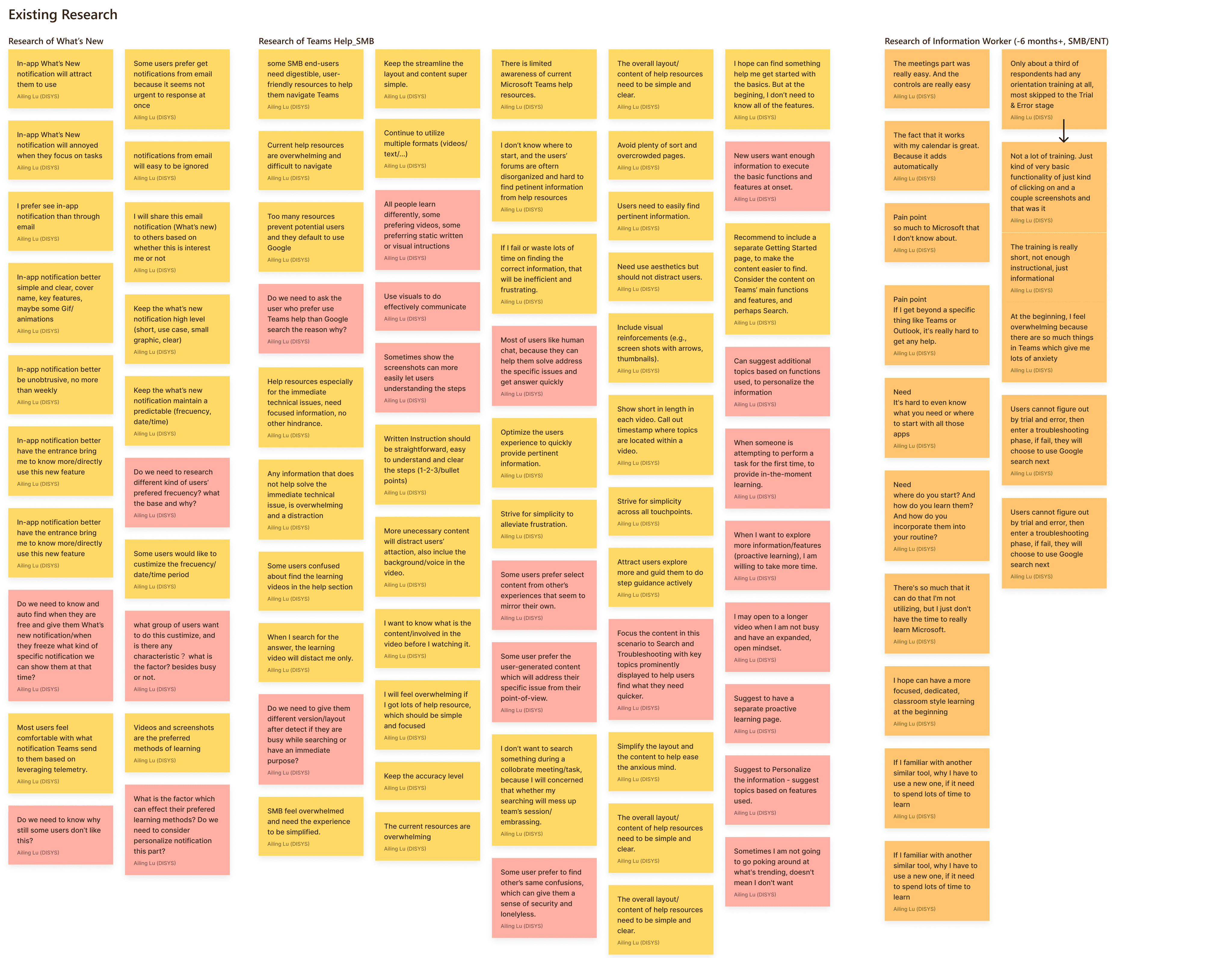
Research Themes
Research Themes
Three themes emerged as the biggest opportunity areas:
Three themes emerged as the biggest opportunity areas:
Discovery
Discovery
People rarely clicked on help and global search did not include search results.
Engagement
Engagement
Engagement, especially with video content, was higher in-app than in help.
Relevance
Relevance
Users struggled to find relevant and targeted self-service content when in need.
DESIGN THINKING
DESIGN THINKING
Aligning on the challenge, audience and scenarios
Aligning on the challenge, audience and scenarios
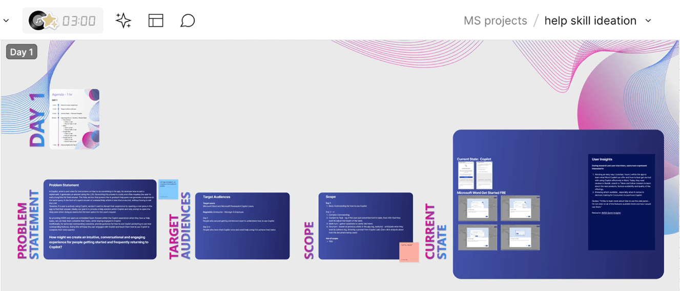
I led a prep session for a 3 day design thinking virtual workshop to identify our focus. The team used research insights to prioritize three audiences and three high-impact scenarios.
I led a prep session for a 3 day design thinking virtual workshop to identify our focus. The team used research insights to prioritize three audiences and three high-impact scenarios.
DESIGN CHALLENGE
DESIGN CHALLENGE
How might we make help and learning experiences personalized to information need and learning style ?
How might we make help and learning experiences personalized to information need and learning style ?
Target Audience
Target Audience
Small businesses with no IT team and limited access to tech training
Small businesses with no IT team and limited access to tech training
Remote workers who lack "over the shoulder" support from colleagues.
Remote workers who lack "over the shoulder" support from colleagues.
Employees who are new to Teams or switching from a competitor
Employees who are new to Teams or switching from a competitor
Scenarios
Scenarios
Get started
Get started
How to help people get set up in during their onboard to Teams.
How to help people get set up in during their onboard to Teams.
Immediate support
Immediate support
Seek help to solve issues while complete tasks (sending a file).
Seek help to solve issues while complete tasks (sending a file).
Proactive learning
Proactive learning
Access content to grow and build skills (managing remote teams).
Access content to grow and build skills (managing remote teams).
POST-WORKSHOP - FUTURE VISION
Multimodal Help & Learning Canvas
Multimodal Help & Learning Canvas
The future vision concept was a multimodal help & learning canvas that provided people with personalized content and fundamentally changed how users seek and view help in the moment.
Three principles guided the vision and supported goals to increase usage, perceived value and customer satisfaction. They are covered in detail in the next section.

Multimodal
behavior
Multimodal
behavior
“Just for me”
content
“Just for me”
content

Supports info-seeking & learning styles
Supports info-seeking & learning styles
DESIGN PRINCIPLE 1 | MULTIMODAL BEHAVIOR
Responsive canvas
Responsive canvas
To address window management issues - the canvas adjusted flexibly at multiple breakpoints. For example, a user could view learning videos at a larger breakpoint.
To address window management issues - the canvas adjusted flexibly at multiple breakpoints. For example, a user could view learning videos at a larger breakpoint.
Docking right pane
Docking right pane
The canvas could be docked to support side-by-side guidance.
The canvas could be docked to support side-by-side guidance.
DESIGN PRINCIPLE 2 | JUST FOR ME CONTENT
Recommended and contextual content
Recommended and contextual content
The Recommended card included content personalized by role, industry and learning goals. The Are you looking for… card suggested tasks, articles and videos relevant to where the user was (eg. calendar, files) when they chose help.
The Recommended card included content personalized by role, industry and learning goals. The Are you looking for… card suggested tasks, articles and videos relevant to where the user was (eg. calendar, files) when they chose help.
DESIGN PRINCIPLE 3 | SUPPORTS INFORMATION SEEKING AND LEARNING STYLES
Guided pathways for additional content types
Guided pathways for additional content types
Guided pathways 'Quick action' and 'Follow steps' covered new areas including What's New (learning about new features) troubleshooting (getting help with common issues).
Guided pathways 'Quick action' and 'Follow steps' covered new areas including What's New (learning about new features) troubleshooting (getting help with common issues).
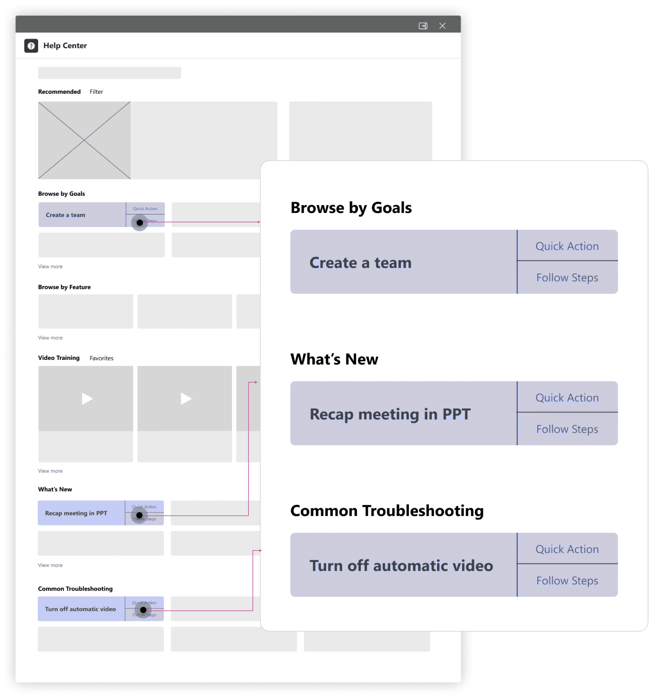
Quick actions
Quick actions
Quick actions, modeled after Quick answers in existing apps, were a way to take users directly through a guided flow to complete an action Join a team
Quick actions, modeled after Quick answers in existing apps, were a way to take users directly through a guided flow to complete an action Join a team
FEEDBACK & LESSONS LEARNED
Validating the design concept
Validating the design concept
We conducted user research to test hypotheses about the target audience and value proposition of the design concept. The interview was conducted with UserTesting. We asked people to answer questions about how they learn and get help when using apps and websites. Here are some of our key learnings:
People do not like to read long articles
People preferred peer content by people in their role/industry, not Microsoft
People saw value out of the interaction between docked sidebar and pop-out states of the help canvas
People preferred to view step-by-step content in the docked sidebar
People liked that content supported multiple styles of learning
People preferred quick videos only (under 10 seconds)
Design Point of View - Whitepaper
Design Point of View - Whitepaper
I created a complementary white paper to document the future vision. I also captured feedback from the full cross functional team to help refine thinking.
I created a complementary white paper to document the future vision. I also captured feedback from the full cross functional team to help refine thinking.